Paper on walls
Accessibility posters, alternative text, a new book on trauma-informed content and an introduction to Frieda Fishmonster.

I'm as surprised as anyone, but this in fact another edition of the Plain English Weekly newsletter and yes it is me, Iain Broome, pressing the buttons.
I'm not going to do this every week (promise), but more and more content people are joining Bluesky, so here are the two links I shared last time again.
That's it. Enjoy the goodies below.
Iain
I've become a poster enthusiast. Seriously. I helped make some simple design principle posters earlier this year and have been amazed by how useful and well received they have been. Paper on walls. It's the future.
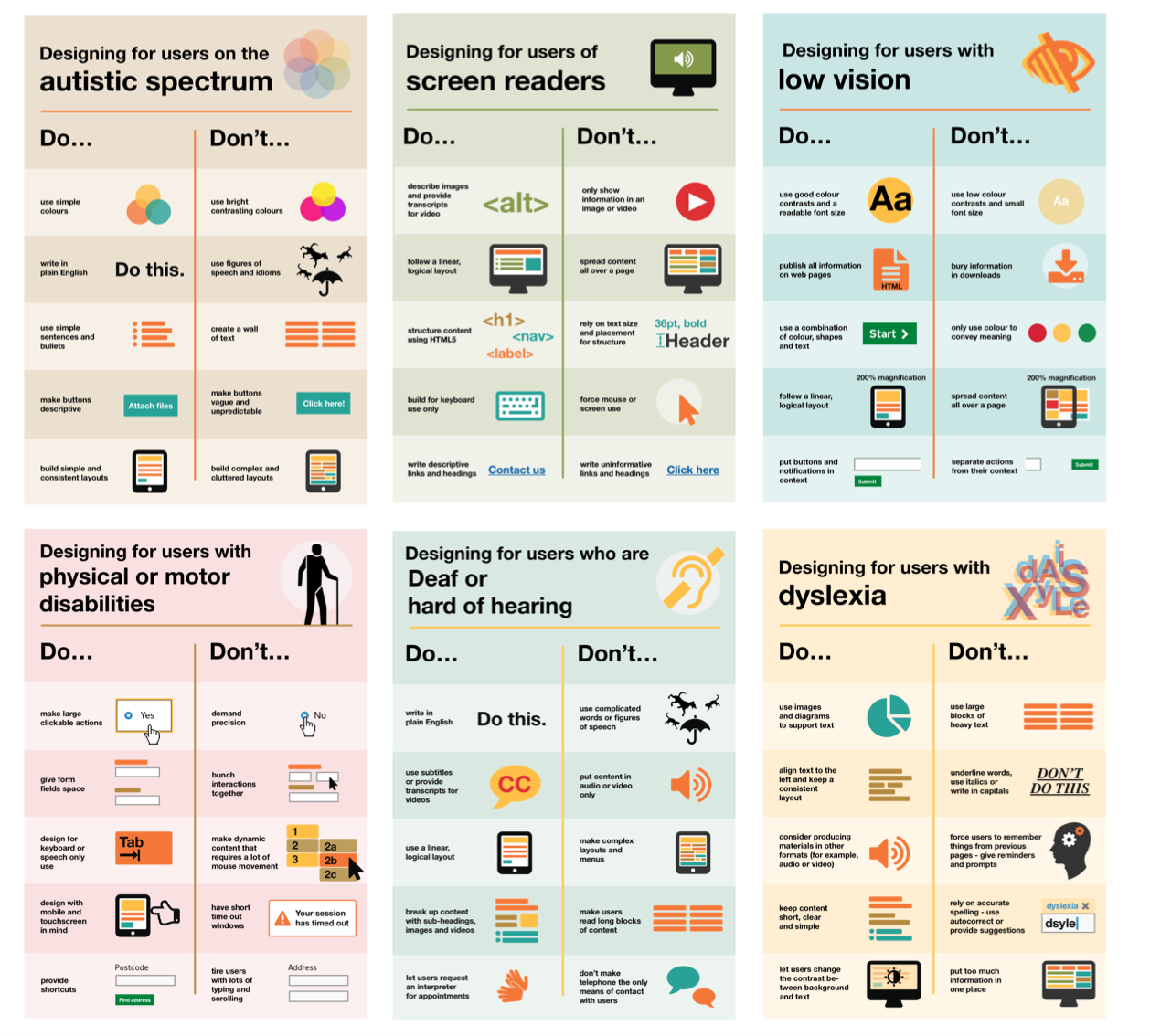
Anyway, you should know about these accessibility posters (pictured above) that you can download from GOV.UK, which include:
General guidance on how to design more accessible services. The guidance covers best design practices for users from these areas: low vision, D/deaf and hard of hearing, dyslexia, motor disabilities, users on the autistic spectrum and users of screen readers.
I'm linking to the HTML version here, but you can also download the posters as a PDF that you can print out and display wherever it will have the most impact. The information is short, clear and extremely important.
I found these posters via this 2016 piece on the dos and don'ts of designing for accessibility.
Designed with Care: Creating trauma-informed content
I'm currently working on a high-profile, extremely sensitive project where trauma-informed content is essential. I feel like I have learned more in the last few months than in my previous 20+ years of being a content person.
And so imagine how pleased I was to find out Rachel Edwards has put together a book on this very subject. I ordered my copy straight away and I'm looking forward to digging in, absorbing it all and comparing notes.
If you are new to the idea of trauma-informed content, I can recommend watching Rachel's Content Folks talk. I've shared it before, but it is well worth 30 minutes of your time.
Co-op's guidance on writing alternative text
A short and simple page that explains the basics of alternative text alongside some examples that are easy to understand. Feel free to explore the rest of the Co-op content guidelines while you're there. It's great.
Inclusion and accessibility for our new website
This blog post is from UK disability charity, Scope and was posted in 2019, so quite mature now in internet years. But to me, it reads like a concise description of how all charities should approach a website redesign.

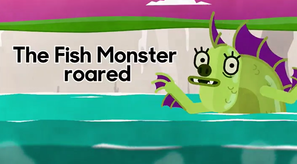
Finally this week, I take you back into the BBC Bitesize archive for you to meet Frieda Fishmonster. I'm not saying you have to complete these activities as a way or testing your plain English skills, but would it hurt? I won't tell anyone.
"Two million people in the UK have a learning impairment, like dyslexia, that affects their ability to absorb and digest information. So making the website easy and intuitive to use, written in clear plain English, was vital. A mantra emerged of 'great usability leads to great accessibility'."
Scope
New reader?
Join a growing community of almost 900 plain language champs and start getting advice and resources that help you write clearer, more accessible content.