Power and meaning
An inclusive design guide, accessible fonts, measuring content with analytics, better Apple Notes, and the power and meaning of words.
It's only another edition of the Plain English Weekly newsletter arriving in your inbox having literally just been sent by me, Iain Broome.
I don't know about you, but with Christmas now apparently right there in front of us, things are busy, busy, busy. So I won't keep you long, except to say that I hope to run a first Plain English Club webinar early in the new year. Look out for, and I'm not proud about putting it like this, more deets soon.
That's it. Enjoy the links below.
Iain

Lots of wonderful stuff for you to get your teeth into here:
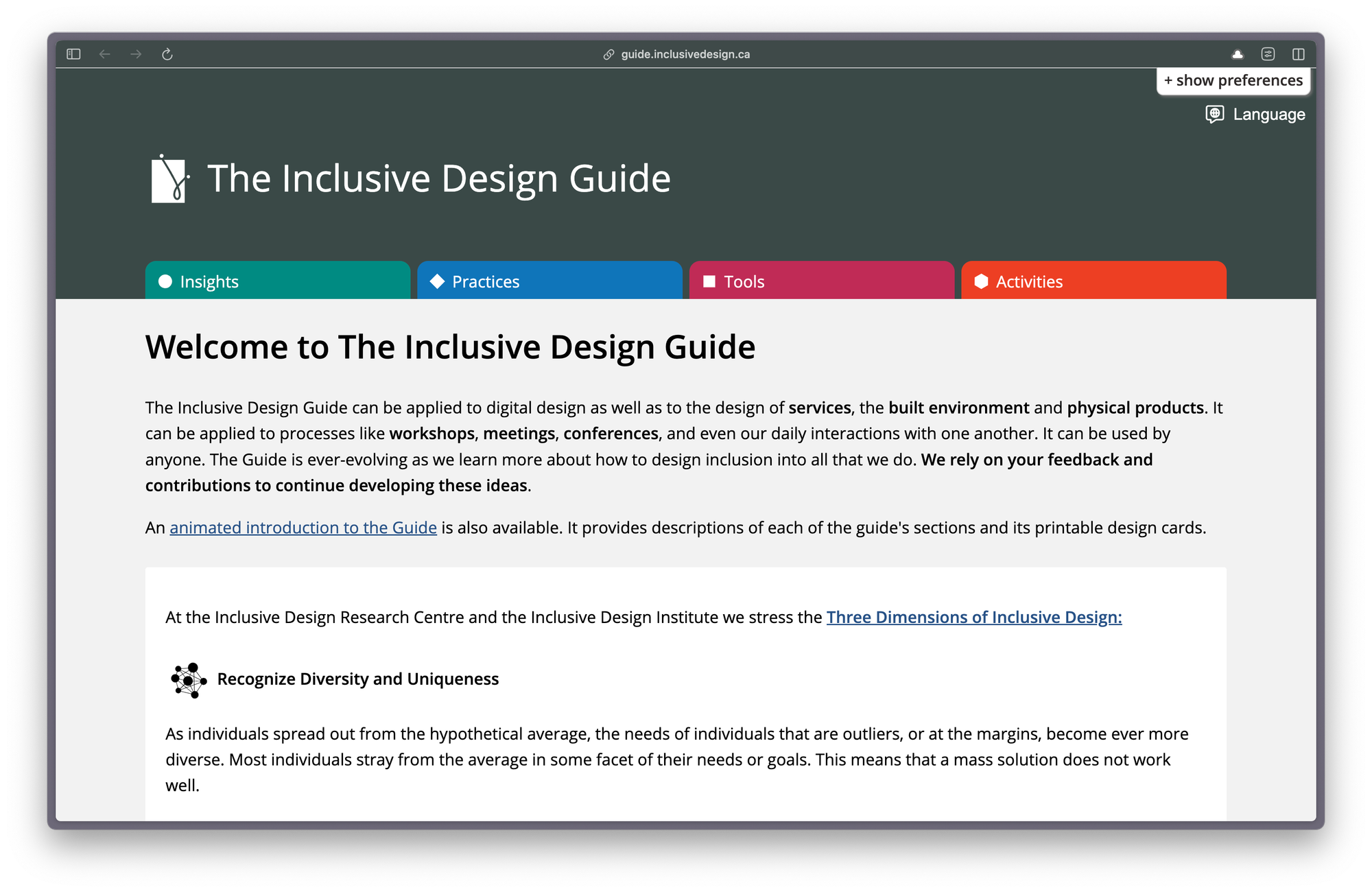
The Inclusive Design Guide can be applied to digital design as well as to the design of services, the built environment and physical products. It can be applied to processes like workshops, meetings, conferences, and even our daily interactions with one another. It can be used by anyone.
By the way, I found this via an excellent collection of accessible design resources put together by Chris Nasrawi.
What makes a good, accessible, easy to read font?
Interesting stuff on accessible fonts from Lizzie Bruce:
When looking for the best fonts for reading, you'll want to consider both legibility and availability. The ideal fonts are not just the easiest fonts to read on web pages but also the fonts available to most of the audience.
I like this short blog post on words by the Tiny Content team, Nia Campbell and Adrián Ortega. It reminds me of a question I always annoy people with: "What do you really mean?"
Using clear language often forces stakeholder types to properly think about what their policy or paper is saying. Because words are important. They have power and meaning, which is something often forgotten.
Find where your service content isn’t working using web analytics
Super new post by Jack Garfinkel on the Content Design London blog:
When you start measuring the pattern of traffic, you can find pain points and fix them. And the good thing is this method works for 3 pages or for 3,000 pages.
This is great if you have never tried to measure your web traffic before, but it also provides some useful practical steps for using Google Analytics. As does this page on Google Analytics for content design by none other than the New Zealand government's digital team.
ProNotes formatting bar in action
ProNotes – an extension that adds useful features to Apple Notes
Forgive me for this link, as it really isn't anything at all to do with clear language or content design. But if you use Apple Notes, this one is for you.
ProNotes is a tiny app or extension that adds a few excellent features to Apple Notes, including:
- a formatting bar
- being able to write in Markdown
- slash commands (think Notion or Google Docs)
I've been using ProNotes for a while and I'm not sure I could go back. Oh, and it also happens to be free. Lovely.
"Through words, we create visions of the future, potential realities, and alternative possibilities. But this same language that brings us together and connects us also shapes, and sometimes limits, how we understand the world. Words influence how we think and perceive - and our thinking and experiences, in turn, shape the words we choose."
Tidy Content
New reader?
Join a growing community of 900+ plain language champs and start getting advice and resources that help you write clearer, more accessible content.